

The Problem
Without a doubt, subscription services have made our lives easier and more enjoyable. With just a simple click, we have convenient access to the music we enjoy, the movies we stream, and the video games we play.
However, people are finding it difficult to keep tab on all of their subscriptions. Given that payments are automatically charged to our accounts on a monthly (or yearly basis), it’s easy to forget the that we are paying for it - even for services we might not need anymore.
This begs the question: Are you paying attention?
The Objective
How might we design a Subscription Manager mobile app to help users to keep track of payment due dates, avoid unnecessary charges, and stay in control of their finances?
Research Insights
Subscription Overload
Users often have multiple subscriptions across various platforms and services, such as streaming services, software subscriptions, gym memberships, and more. Managing and keeping track of all these subscriptions can be overwhelming and time-consuming.
Assumptions
This design challenge is mainly focussed on design execution. However, to aid the conceptualisation and design of the solution, below are a list of assumptions to guide the design. [Insert visuals of assumptions]
Design Process
How can we design for Time Sensitivity?
#1 Use progress bars to visually indicate status
Progress bars are traditionally used as a form of visual representation of how much of a task has been accomplished by the user. When used in this context, progress bars are helpful to notify users by providing a quick and easy understanding of how close the user is to the end of the billing cycle. The main intention is to motivate users to cancel any unwanted subscriptions on time.
Here, I have explored using two types of progress bars - horizontal and circular. [Insert visuals]
#2 Use colours to evoke different levels of urgency
Based on the conventions of universal traffic light colours, we can use the colours red, amber and green to signify different types of payment due dates. [Insert visual]
Now, what would it look like if we combined both progress bars and colours together in the design? Here, I have created 3 iterations of key information cards that would appear on the dashboard in the home screen.
For the first iteration, I have kept the design simple and clean by only showing the key summary of a subscription along with the number of days to payment due.
In the second iteration, I have explored using a horizontal progress bar to convey time-sensitivity. However, the payment due date was seen as less prominent and seems like a secondary piece of information instead. Moreover, the elements within the card also seem cramped together in this arrangement.
In the third iteration, I have used a circular progress bar. With the key descriptors left-aligned and time-sensitive info right-aligned, there is a sense of visual balance achieved within the card.
Overall, [WHICH option is the best?]
When we are thinking about designing for time-sensitivity, we also have to take into account the content layout of the dashboard. In my design exploration, I have considered using both a grid and list layout. Let’s talk about the pros and cons of each type of layout.
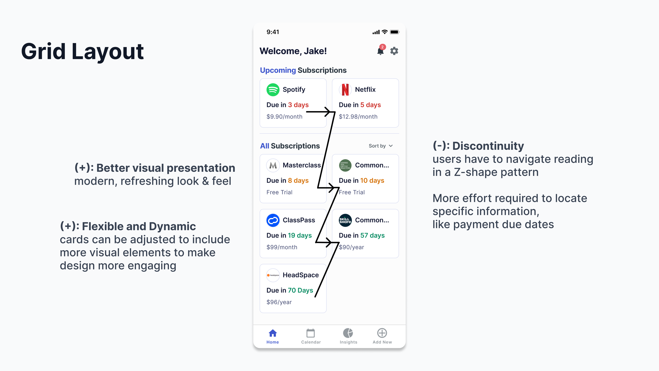
Grid Layout
Better visual presentation: Grid layouts are best for content-rich platforms. It allows for more visual elements to be included, such as images and videos, making it more visually appealing to users. This makes the browsing experience more delightful and enjoyable for users.
Flexible and dynamic content:
List Layout
Consistent content display: A list layout provides a more consistent display of content, making it easier for users to scan through and find what they’re looking for quickly.
Limited visual presentation: A list layout has less space to include and arrange different visual elements since it follows a traditional, linear format. This makes it potentially less visually engaging for users.
Which content layout is the best?
We have to most importantly consider: “What mindset are users in at this point of their experience?”
Some users are in browsing mode…let me just hop onto this app to see what my upcoming payment due dates are… they are curious, they want to be informed to stay in control…
Others might be explicitly searching for a particular upcoming payment due date… they are anxious because they are afraid they are going to miss cancelling a subscription…
A list layout is more compact, the most efficient way to organise content to aid scanning process.
They ease users’ job of quickly scanning payment due dates.
Card layouts support users’s goal of scrolling or browsing through content casually.
Since we are supporting users to be able to quickly access a particular type of information - ensure they get quick access to needed information as effortlessly as possible.
Hence, scanning through a vertical list (which is far more easy for eye-scanning), than a dashboard of cards featuring no helpful hierarchy, increases their chances to find what they are looking for quick, with no unnecessary distractions.