

Overview
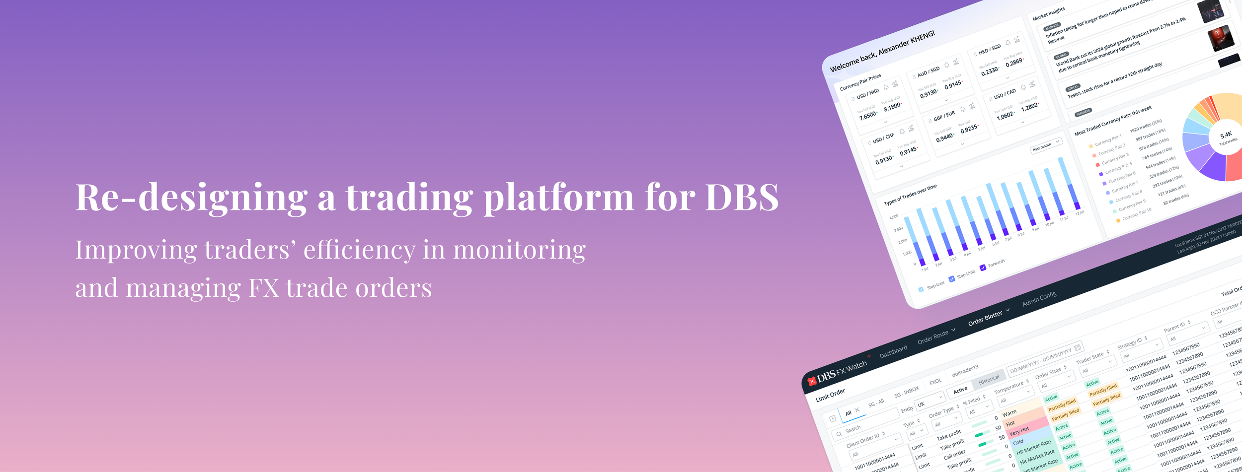
This case study will examine how I have re-designed a trading platform to create a more efficient workflow for traders to manage and monitor high-volumes of foreign-exchange trade orders for DBS.
About the Project
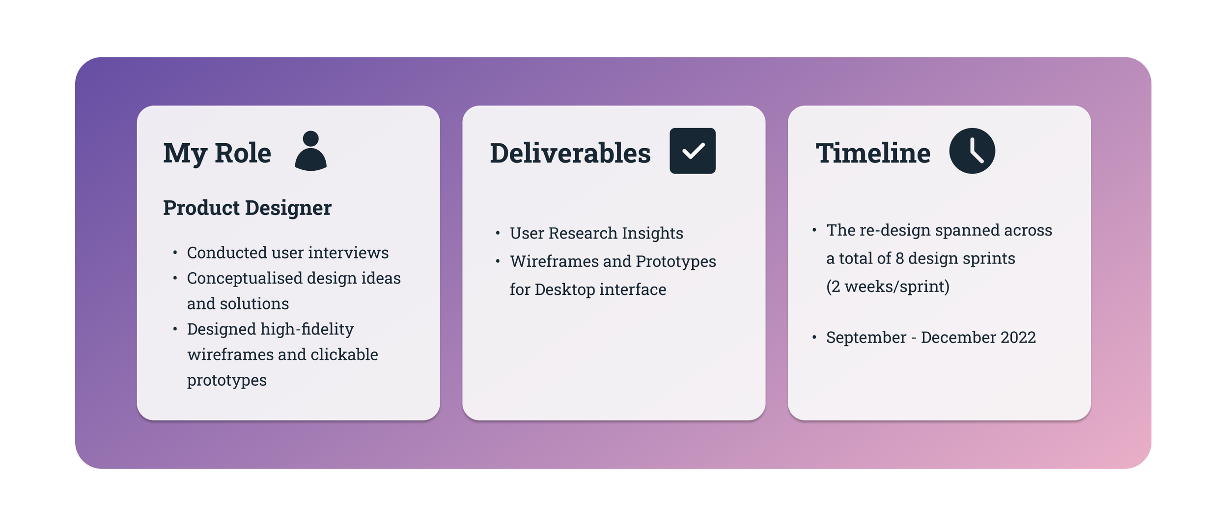
Understanding the Goals of the Project
What is FX Watch?

What was the problem to solve?
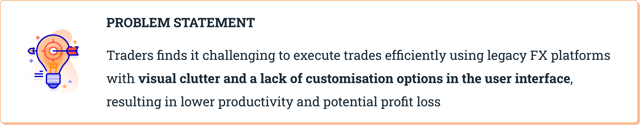
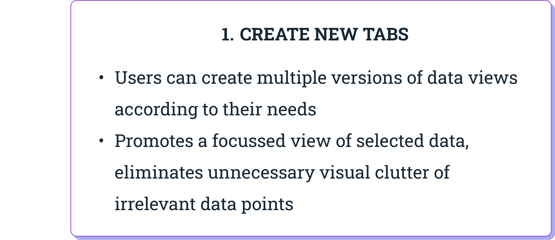
1) Lack of User Interface Customisation
Customising the interface, including layout and information display, was costly and time-consuming due to reliance on third-party providers for maintenance.
What are the impacts?
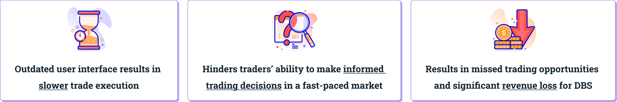
Why was a re-design important?
DBS traders rely on several legacy platforms with outdated user interface to conduct high-volume training activities. These dated platforms were outsourced and developed by external vendors more than 10 years ago.
As a result, using these interfaces today creates unique challenges for users and the business, these include:
2) Limited System Capability
Slow response times and sluggish data updates significantly hampered traders’ ability to react quickly to market movements and take advantage of time-sensitive opportunities.
Overall, a re-designed user interface with a focus on improved usability is crucial for both traders and the bank.
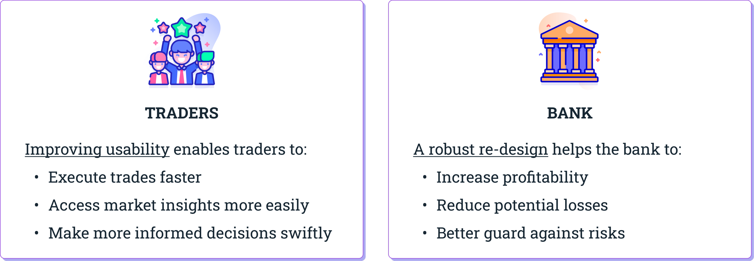
By simplifying the workflow and reducing complexity for traders, it reduces their cognitive load and allows them to navigate the user interface more effortlessly. This results in a boost in efficiency and productivity.
In addition to enhancing the trading experience for traders, delivering a well-executed re-design helps the bank gain a competitive advantage. This contributes to enhance the bank’s positive reputation and positions itself as a leader in the trading market.
Deep-diving into our Target Users
Who are our users?
DBS traders are individuals who possess deep domain knowledge and expertise in financial markets. They are experienced with buying and selling currencies in the foreign exchange market on behalf of the bank.
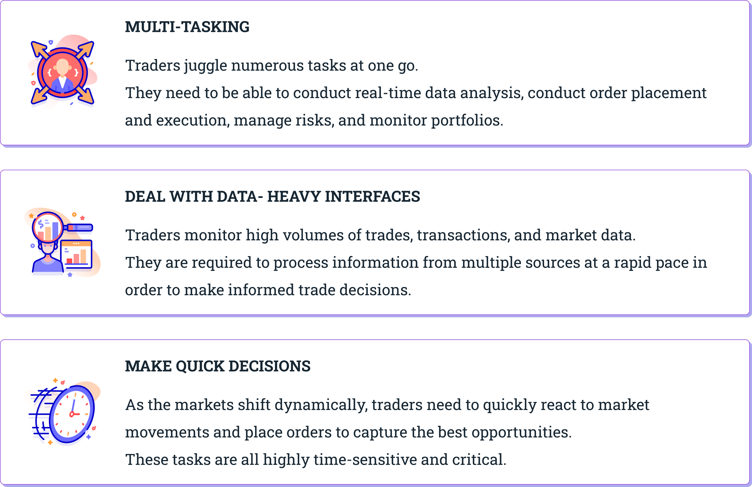
We consider them our Power users because they are involved in complex set of tasks, deal with high volume of trade activity, and require sophisticated tools and interfaces that are specialised to support their workflow.
One thing that really stands out about their work environment is that each trader has 4-6 monitor displays stacked closely in their station! Let me tell you more why this is crucial for them.
How did we get to know our users’ needs better?
I conducted Field Visits on the trading floor of DBS to understand our users’ context and needs. The wonderful thing about designing for an Enterprise product is that our users are easily accessible to us!
While observing our users in their work environment, I sought to understand their context from a holistic perspective.
Functional Needs:
How do they get their job done on a daily basis?
What platforms do they use?
What are some usability concerns they encounter?
Emotional & Psychological State:
What emotions/thoughts do they experience as they work?
What are the challenges and pain points they experience?
So, what is their context?
What are users’ challenges and painpoints?
What are the usability issues encountered?
1) System gives false impressions of ‘errors’
Take a moment to look at one of the trading platforms on the right. What first comes to mind?
You might think… “Did I make many errors?”, “Did I do something wrong?”. Did you also feel anxious or panicked too?
Well, that was not what they system originally intended.
The rows highlighted in red were meant to denote that the trade order’s Temperature. In this case, red referred to hot which is how close it is to the current market price.
However, because the colour red was applied so liberally across the data rows, it ends up becoming misleading and confusing to users that an error had happened.
2) Challenging to make sense of data easily and quickly
In another commonly-used trading platform, you will similarly notice that the user interface features a data table. Data tables are useful as they are compact and can display large amounts of information.
However in this case, users had to navigate up to 53 distinct data columns while monitoring trade orders. Can you imagine how overwhelming that feels?
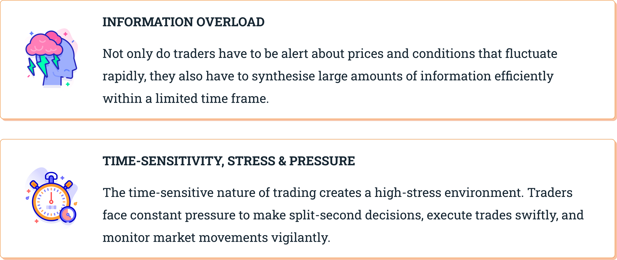
This lack of information hierarchy in the data table meant that users experienced a heavy cognitive strain as they couldn’t monitor the most salient trade data.
In addition, our traders expressed that they could not organise information according to their preference that’s easy to scan so that they can look for patterns and develop insights from the data.
3) Visual clutter strains users’ cognition
Visual clutter in a trading platform can also strain traders' cognition and decision-making abilities.
When design elements have varying visual appearances, traders need to spend additional mental effort to process and understand them. The use of multiple colours and varying font weights in the trading platform creates visual noise and distract traders from important information.
This design inconsistency hinders intuitive navigation, disrupts hierarchy of information, making it harder for traders to focus on critical information and make quick decisions. It also contributes to information overload and thus impacts their productivity and efficiency.
Defining the Problem Statement
Through conducting 5 one-to-one user interviews with traders, I gained a deeper understanding of their experiences and usability pain points with the trading platforms they use on a daily basis. I intentionally asked open-ended questions to encourage our users to share their thoughts and to provide specific examples of usability issues they have encountered in their workflow.
Here are the top usability concerns identified:
Now that we have clearly defined users’ needs and painpoints, we can use these insights to move to the next stage of exploring and brainstorming solutions.
Solutioning: Exploring possible ideas
As our traders deal frequently with data-heavy platforms and experience information overload in their daily work, it is crucial that we address this issue urgently.
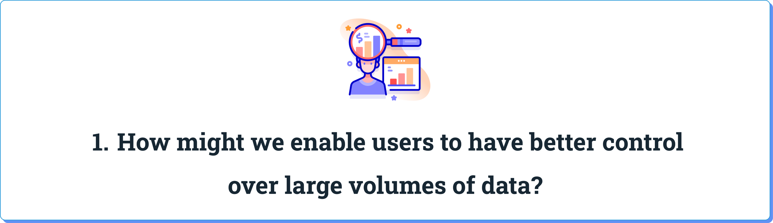
We know that traders also struggle with scattered and fragmented data from various sources. In fact, they need to monitor real-time market data and portfolio performance to identify trading opportunities and mitigate potential risks effectively.
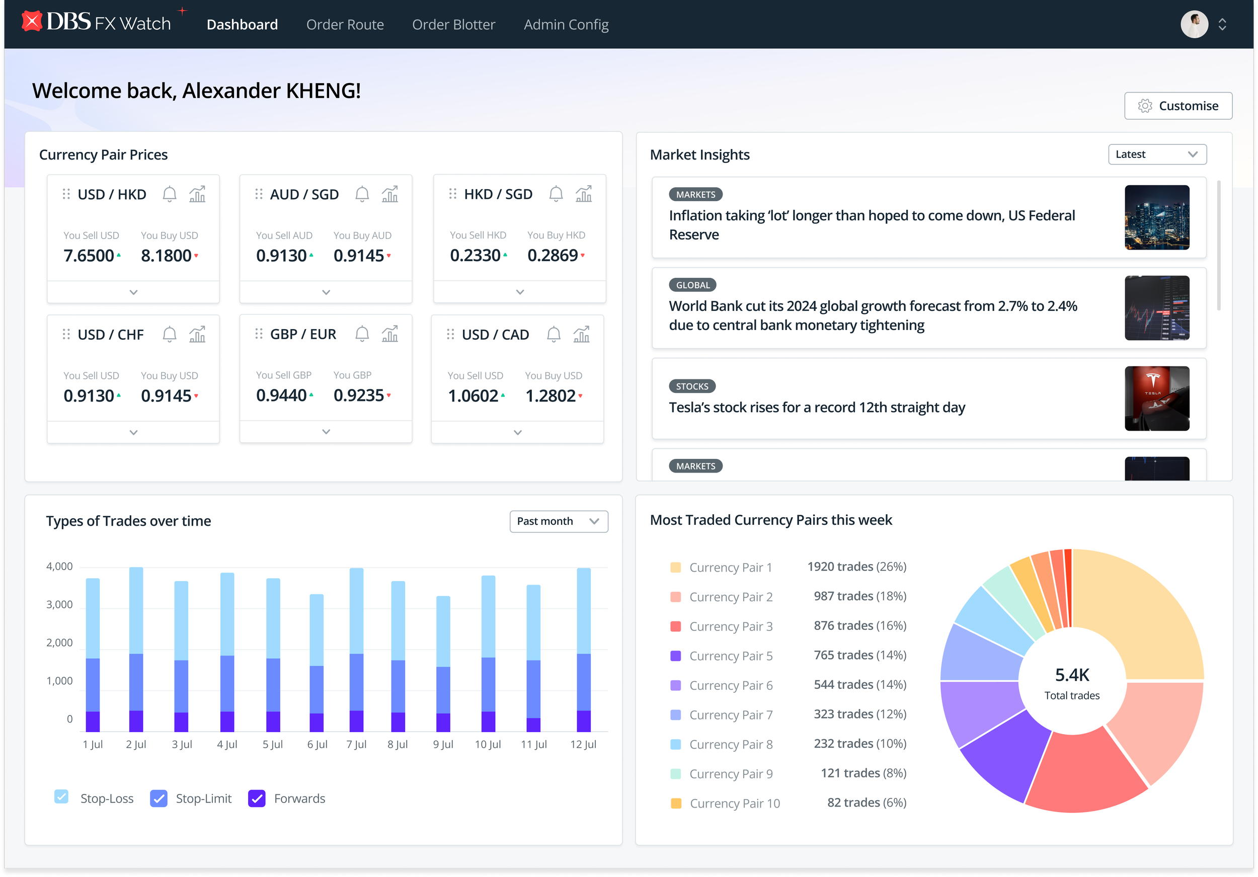
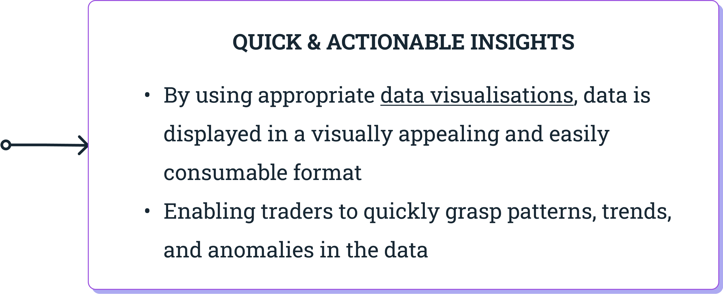
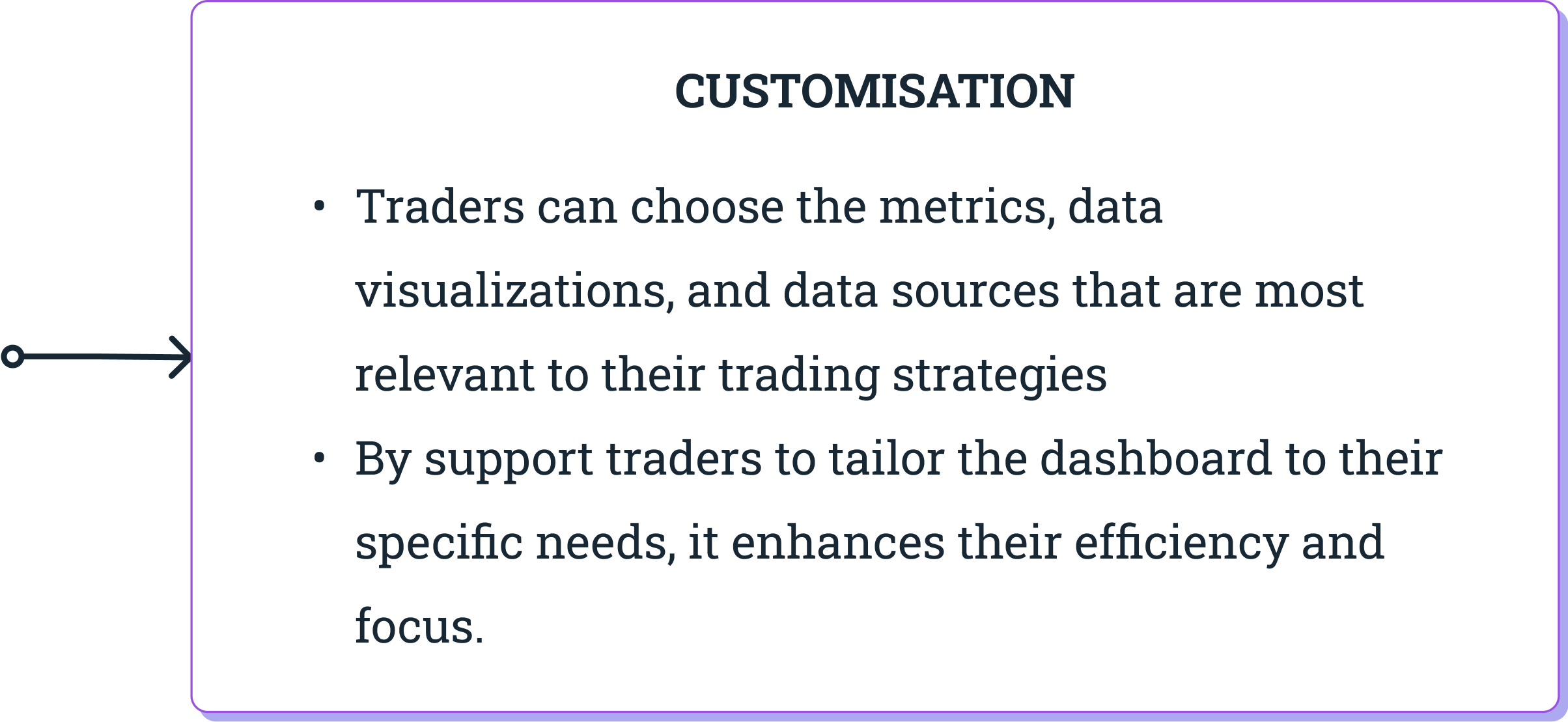
An insights dashboard solves this pain point by consolidating critical data into a single, unified interface.
✅ This eliminates the need to open multiple screens and switch between applications to access key information. Users are able to quickly access the data they need with a glance, thus saving time and reducing cognitive load.
✅ Moreover, an insights dashboard can synthesise vast amounts of data into bite-sized insights, allowing traders to quickly understand and interpret complex information and make decisive trading actions.
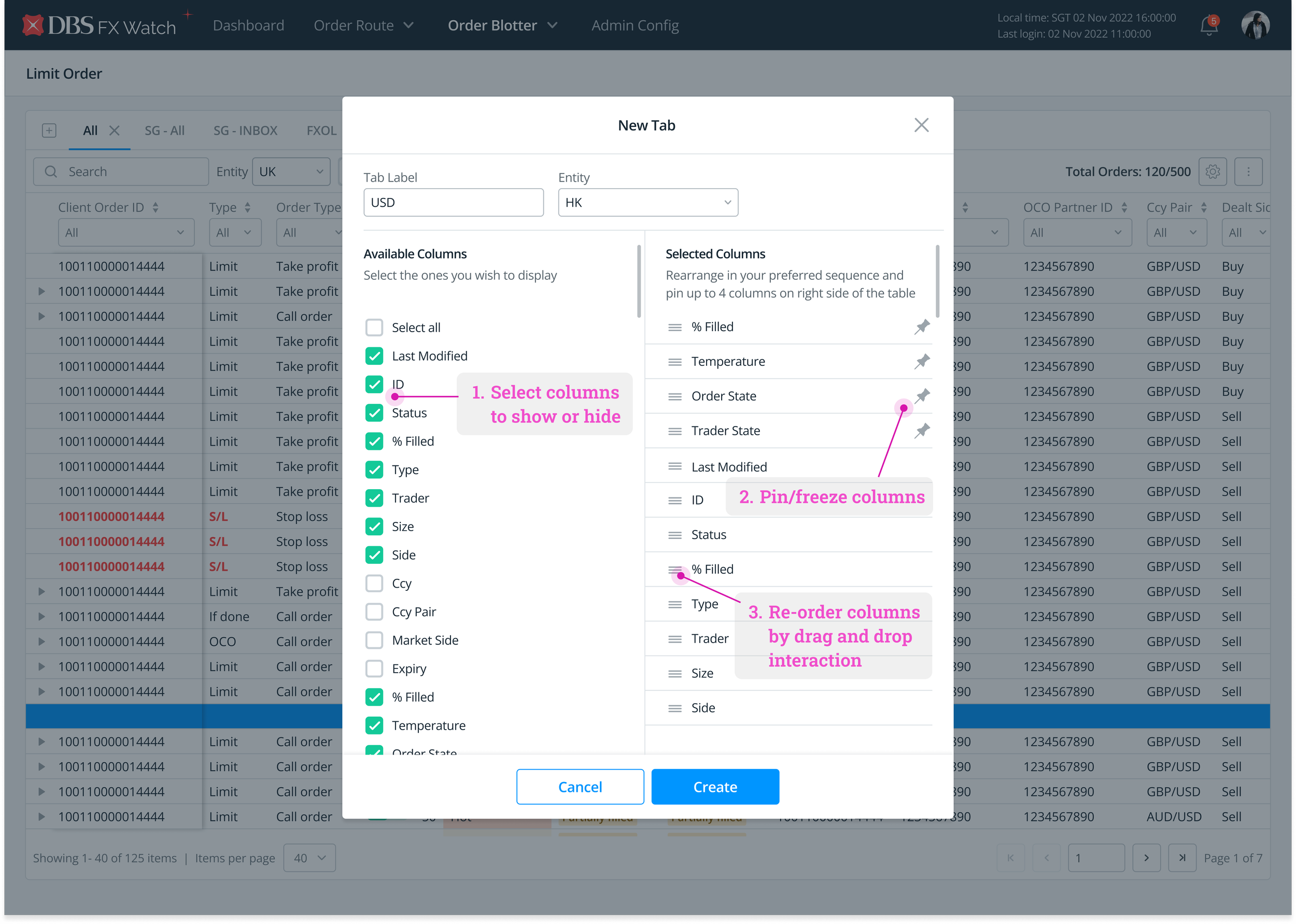
1) Re-order columns based on level of importance
Comparing data is one of the core tasks performed by traders.
At times, the columns users wish to compare are far away from each other - with one being even perhaps off screen and requiring horizontal scrolling to view. Not only is scrolling back and forth tedious, but users will also need to memorise data from one column, bring the other column into view, and compare what they remember with what they see.
Hence, data points of interest should be allowed to be brought in close proximity.
In terms of implementation, users should be in control of deciding the order of columns to be displayed, based on how important it is to get their job done.
2) Hide columns to reduce visual clutter
There are times when traders do not need to monitor across all 53 data columns. By allowing them to hide columns that are not immediately relevant, it empowers them to adapt the table to their individual needs, improving their efficiency and workflow.
Through selectively displaying the most important data columns, it also helps traders prioritize and focus on the key metrics that impact their trading decisions. This ensures that they can quickly identify trends, patterns, or anomalies in the data that require their attention.
The reduced visual clutter allows for more effective data analysis and informed decision-making.
3) Pin/freeze selected columns to promote focus
One of the key ways to support users to locate key metrics quickly is to freeze header rows and header columns.
Traders often have specific key metrics or indicators that are critical to their trading strategies. By pinning these columns, traders can ensure that the most important data is readily visible and available at all times, regardless of the scrolling position within the table.
Traders can quickly refer to important data without losing context or needing to constantly scroll back and forth, improving efficiency and saving time.
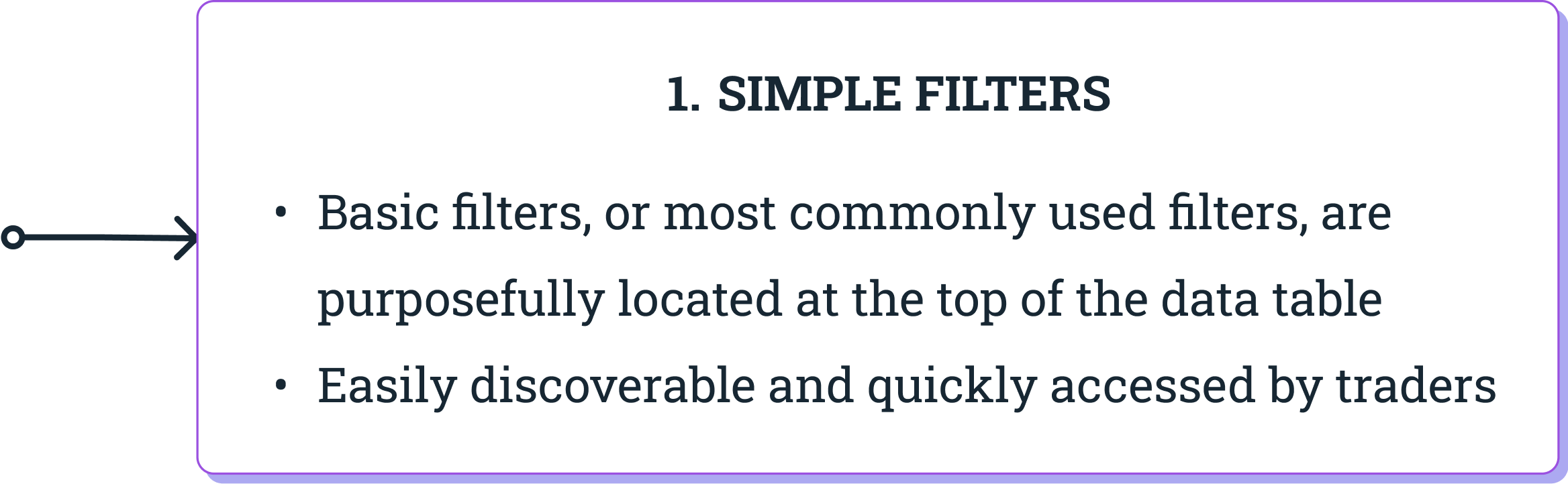
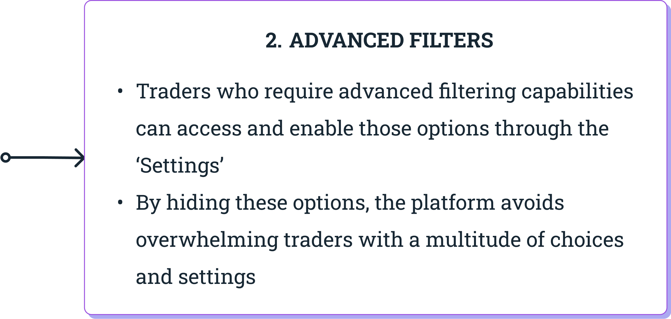
4) Provide simple and advanced filters to cater to varied searches
Another core task performed by users is to search for a specific data point or look for several data points that meet the criteria they have in mind.
To do so, traders need access to both simple and advanced filters.
Users can perform basic searches with most commonly-used filters. These basic filters can be situated at the top of the data table so that they are easily discoverable and quickly accessed.
However, there is also a crucial need to support traders need for more complex searches by allowing them to carry out advanced filtering. These filters contain advanced options to extract specific data points using a more complex set of conditions. Here, users can input customised values, select value ranges, and set parameters to obtain filtered data.
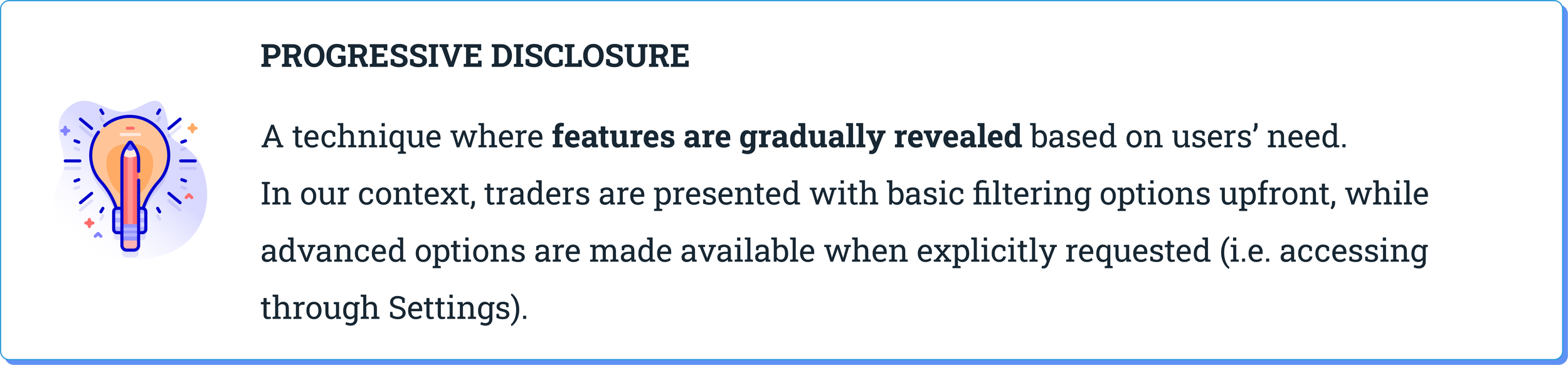
A key consideration for designing filters is the principle of Progressive Disclosure. This ensures that traders are able to perform searches without being overwhelmed by a multitude of filtering options.
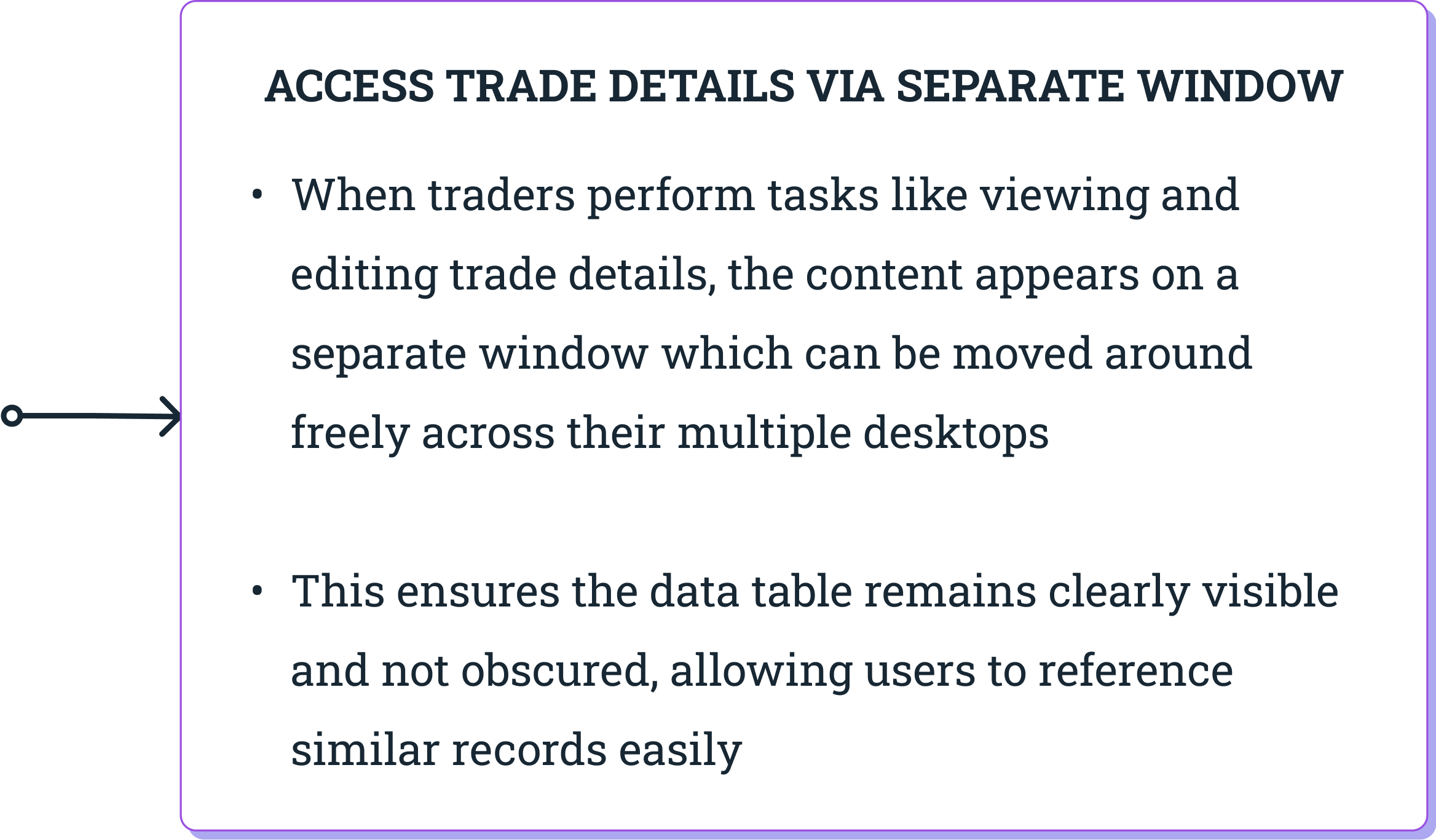
5) Enable viewing and editing of individual records in a separate window
For traders, another common tasks in tables involves viewing, creating, or editing a single record.
In all three cases, a table-like presentation of a single record can be challenging to read (and even more so to edit), especially when the table is wide and the user has to scroll horizontally to access all fields.
So, what might be the best way to present a single record as a complete unit that it optimised for readability and editability?
Let’s look at the trade-offs among several options:
Option 1: In-line Editing
✅ A convenient and quick way to edit table’s content. User remains on the same page without navigating elsewhere from the current view.
🚫 This solution only works if the table is narrow. In our traders’ context, editing in place across 53 columns doesn’t seem feasible or user-friendly.
Option 2: Modal Popup
🚫 The big downside with a modal implementation is that it covers records in the table and user won’t be able to reference or copy data from a similar record.
💡 We have observed our traders referring to existing data in other records while they edit a record, as that helps them to recognise, rather than recall reasonable value ranges).
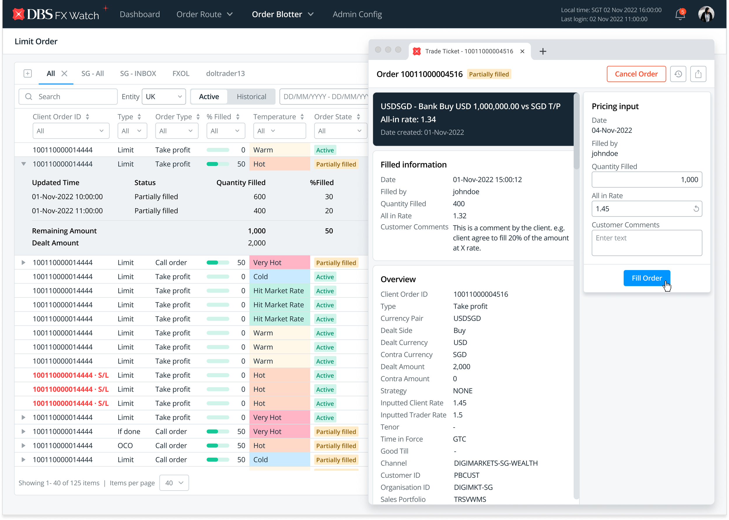
Option 3: Separate Window
✅ Using a separate window for viewing and editing a record ensures it does not obscure other parts of the table. Traders can accurately and efficiently modify individual records which promotes focus and prevents errors being made.
💡 This is the best option so far. As our traders utilise 4-6 monitor displays, they are able to drag the new window to any available space on their screens. This ensures that the table isn’t covered and users still have access to the table data when carrying out deep editing work.
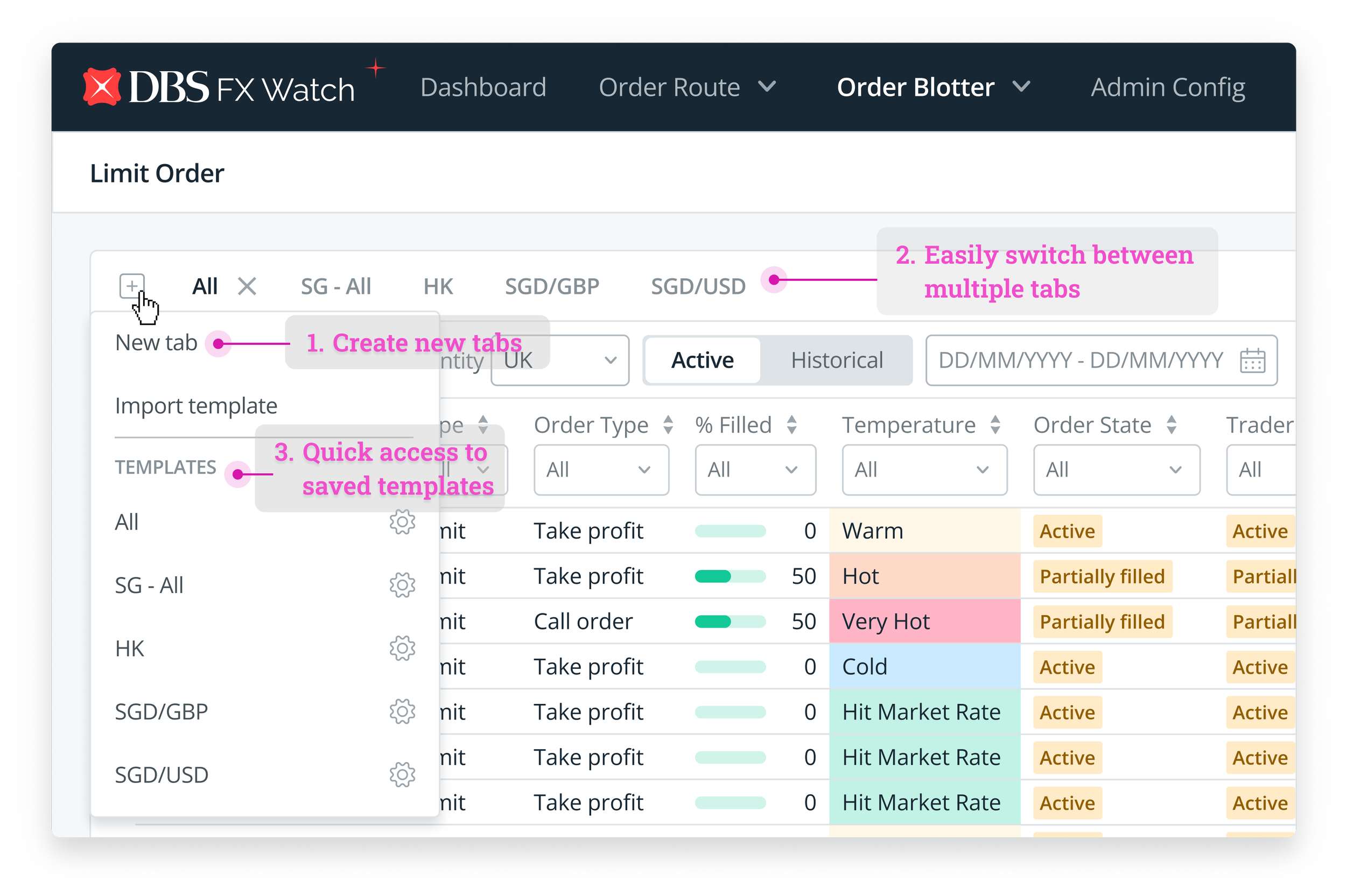
Example of customising order of columns
Example of hiding selected columns
Example of pinned/freeze columns
Example of advanced filtering on Gmail
Example of in-line editing in a table
Example of modal popup for editing obscuring information on the table
Example of opening a new, separate window
Designing the Solutions
In our search for solutions to re-design the trading platform, I have generated multiple ideas and possibilities and narrowed down some of the best options to move forward with.
When executing the design, I leveraged on DBS’ Enterprise Design Library and utilised its design system to bring to the solutions to life. Now, let me walk you through the key designs of the solutions!
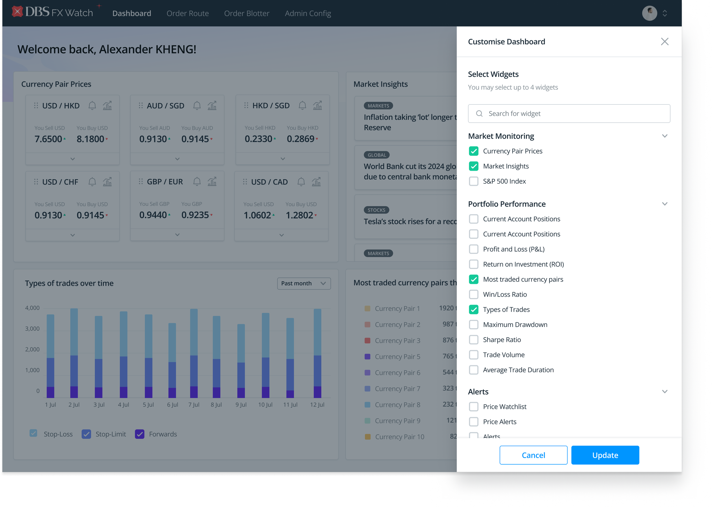
Insights Dashboard
How Traders can manage large volumes of data
Customising the data table to improve information hierarchy
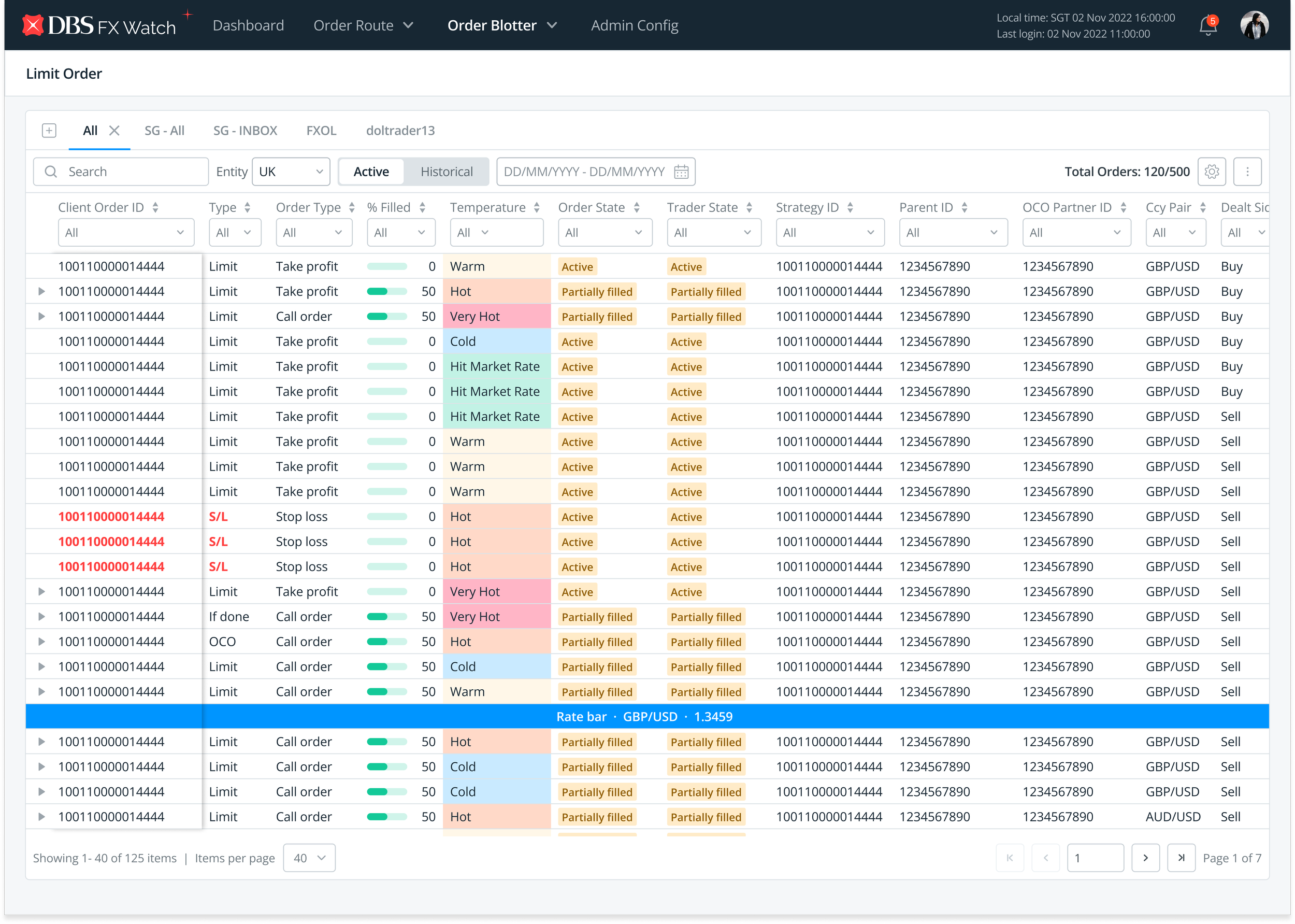
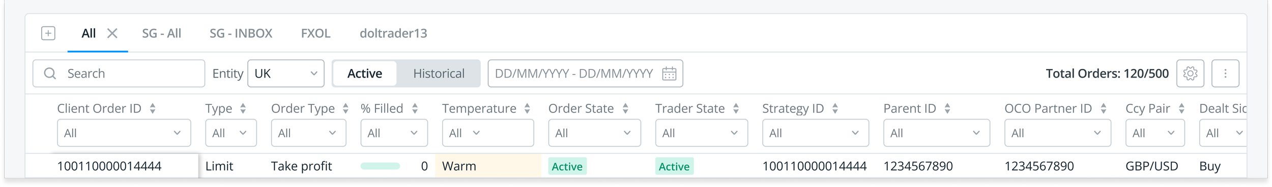
Monitoring Trade Orders in a Data Table
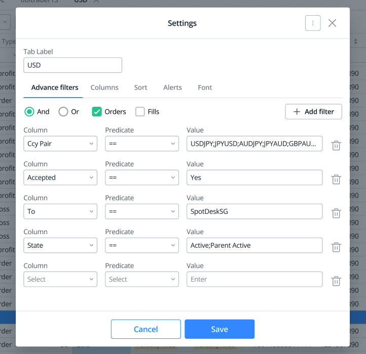
Implementing Progressive Disclosure in Filtering Options
View and edit trade details in a Separate Window
High-fidelity Prototype Walk Through
Curious to see how the prototype looks like? Watch the video below on how the design solutions improves productivity and decision-making for traders.
Measuring the Success of the Redesign
After all the hard work invested into the the re-design of FXWatch, the designs were shipped and went live for the traders! However, I was only able to monitor the platform for only after a month before leaving my role at DBS.
UX Success Metrics
Now, it’s possible to track almost any kind of data, so choosing which success metrics has the most value is a big part of measuring outcomes and impacts of the re-design.
Here are 3 key UX metrics I would be keen on closely monitoring to determine the successfulness of the redesign.
1) Effectiveness
How easy is it for users to accomplish what they need to do?
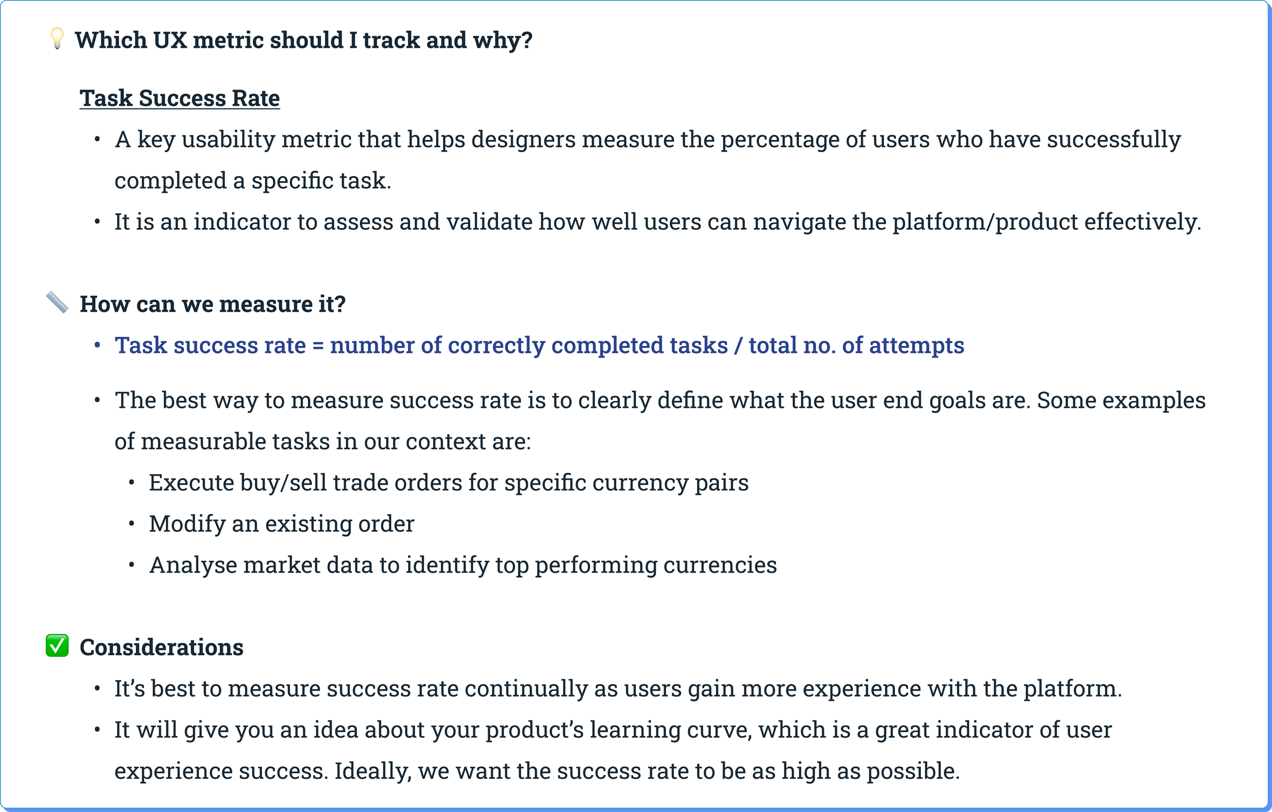
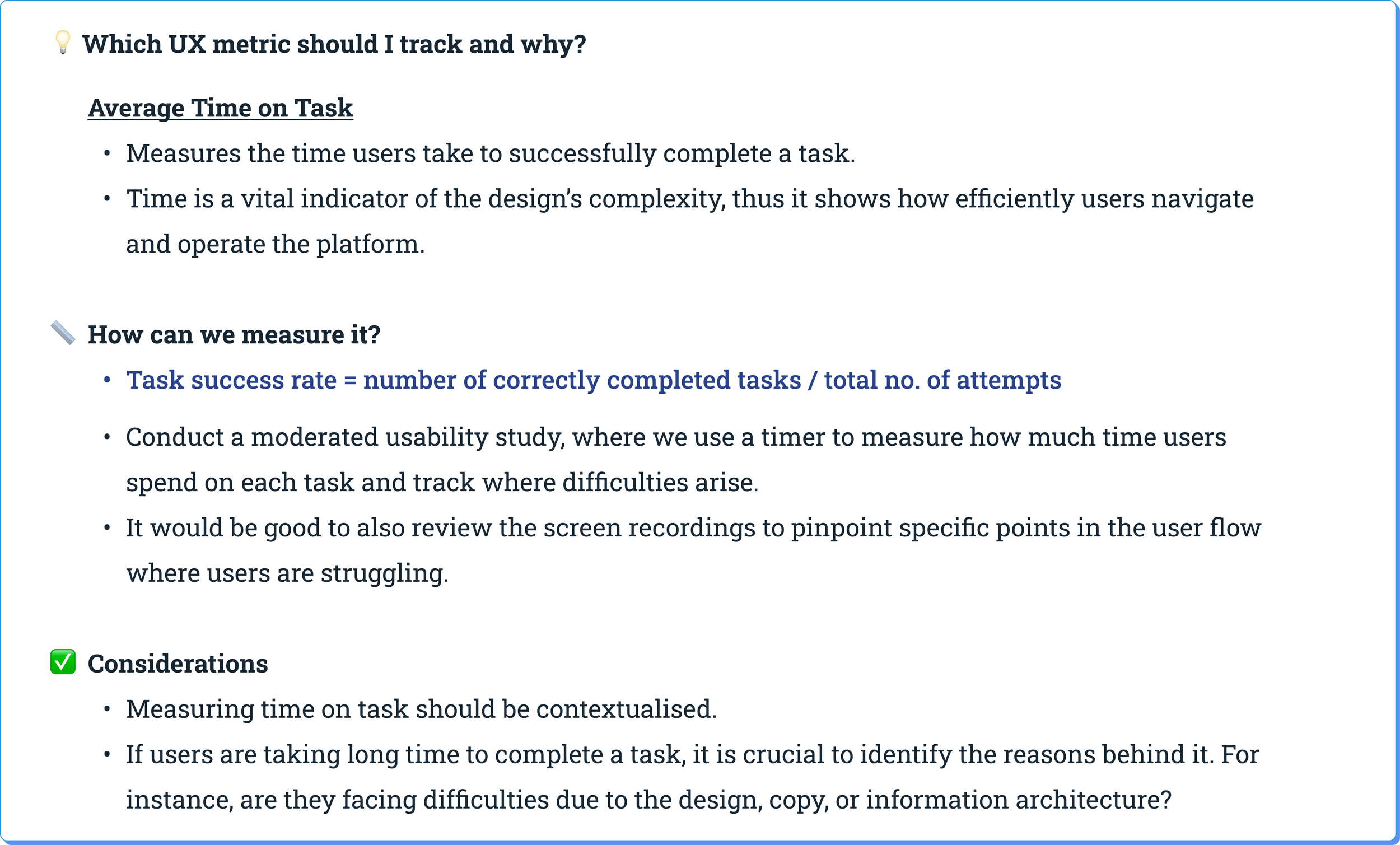
2) Efficiency
How fast can users accomplish their tasks?
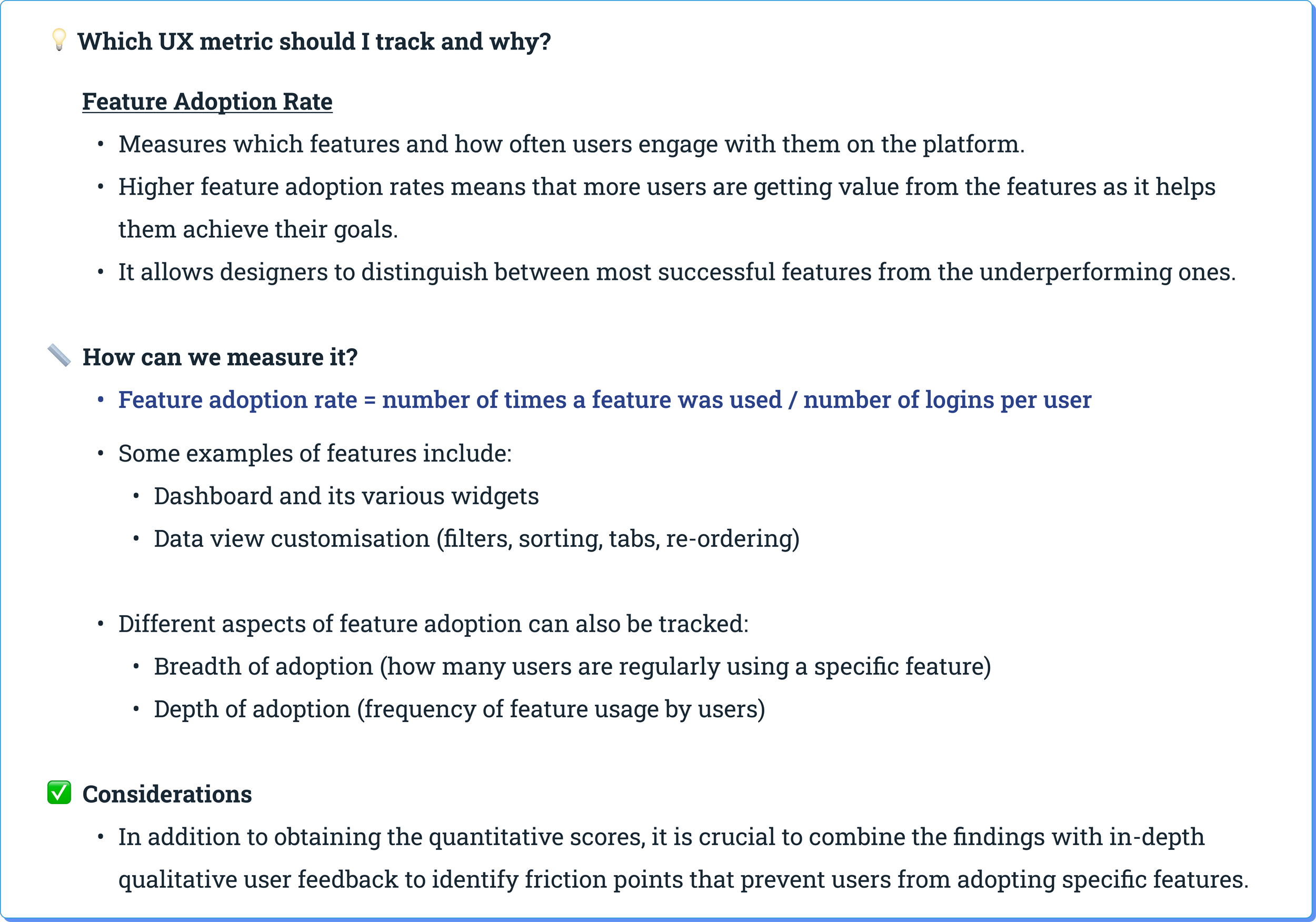
3) User Engagement
How engaged are users with the features in the platform?
Business Success Metrics
When traders are able to effectively, efficiently carry out their tasks in an engaged manner, it is likely that the re-designed FX Watch platform will contribute positively to DBS’ business goals. Hence, it is crucial to not only monitor UX/product metrics, but also keep a pulse on larger, key business metrics as well.
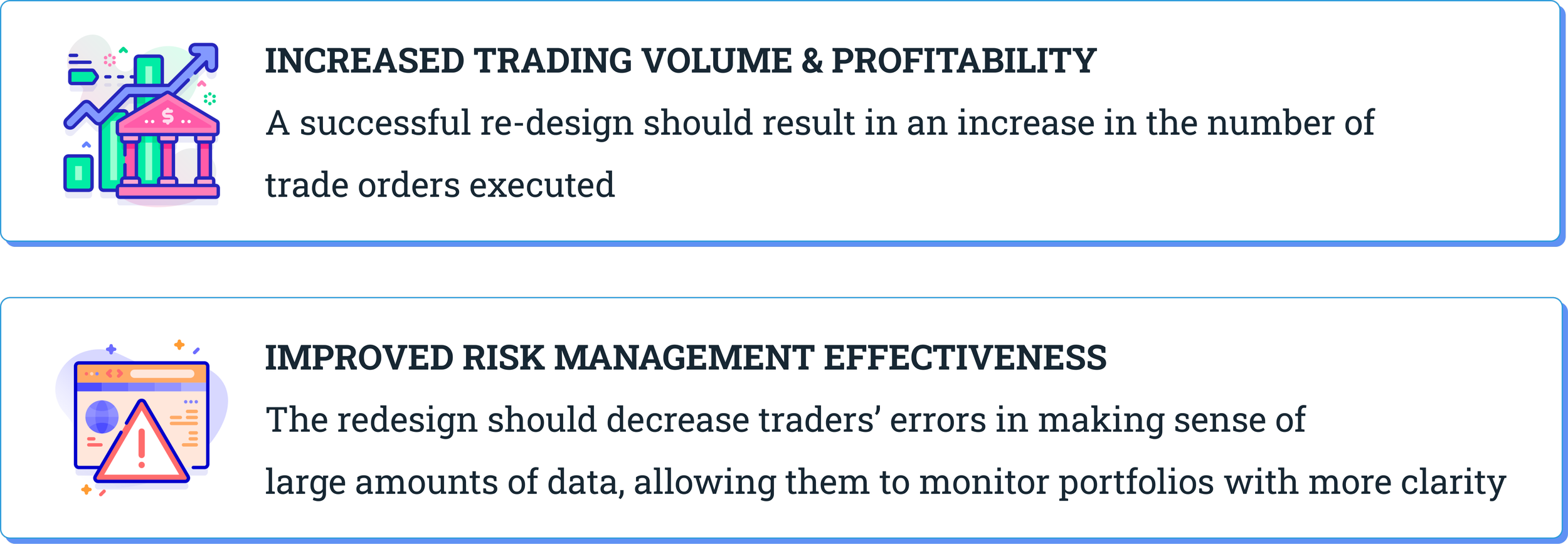
To sum it up, the design implemented should positively contribute to these metrics discussed above, thus demonstrating its value to the bank and its traders.
It is crucial to monitor these success metrics to understand the effectiveness of the design and its impact on traders and the business.
By tracking these metrics, we as product designers can make data-driven decisions, identify areas for improvement, and continuously enhance the design to meet traders’ evolving needs effectively.