

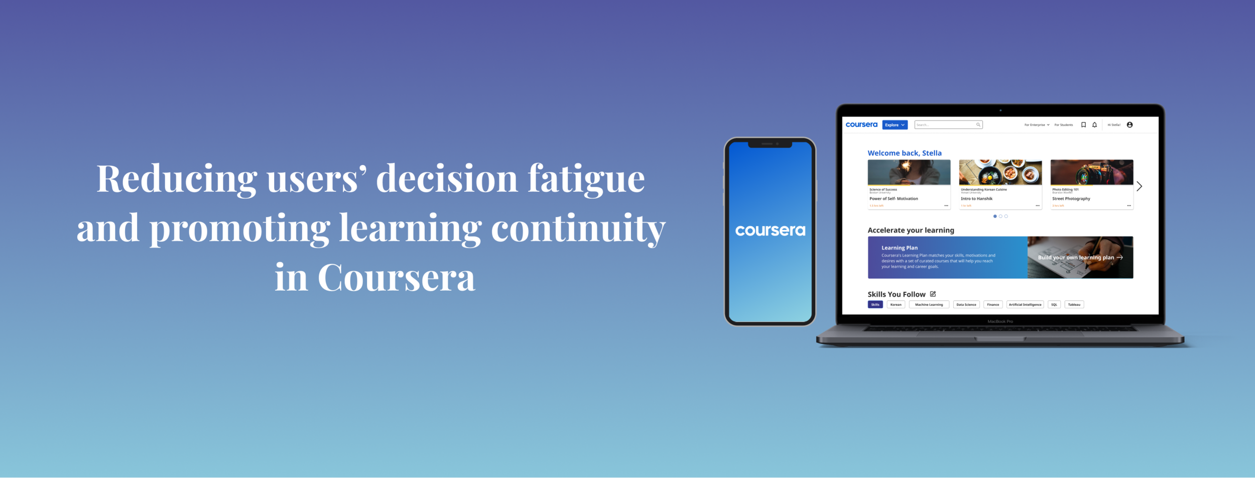
Overview
As the world ushers in a new era of digital transformation, the need to develop skills for a digital future has never been more apparent. Students globally are demanding for high-quality online learning options, while workers are learning job-relevant skills to stay competitive.
In this project, we sought out to redesign the Coursera experience with the aim to better support users in their search, enrolment and learning journey on the platform.
About The Project

Understanding The Business
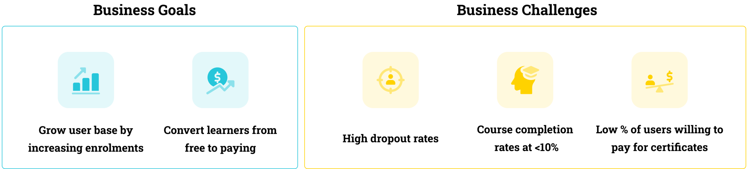
Coursera was initially founded with the mission to provide free and open access to quality education. It evolved its business model over the years to monetise its platform by offering learning products at a wide range of prices that learners can subscribe to on a monthly basis, or for a one-time payment access.
How did we go about understanding Coursera’s business?
We first needed to gain a clear picture of Coursera’s current business goals and challenges. As we were not able to reach out to the company directly to obtain these information, we performed secondary research by extracting critical information from their latest annual report and market intelligence reports.
Understanding The Users
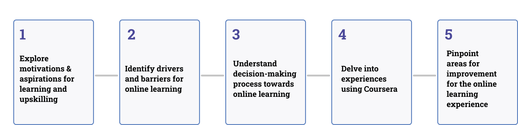
User Interviews
Apart from understanding Coursera’s business, it was important for us to dedicate our time listening to Coursera users’ experience with the platform.
We conducted a total of 10 online interviews with existing and past Coursera users and focussed on uncovering 5 key information areas:
Insights Uncovered
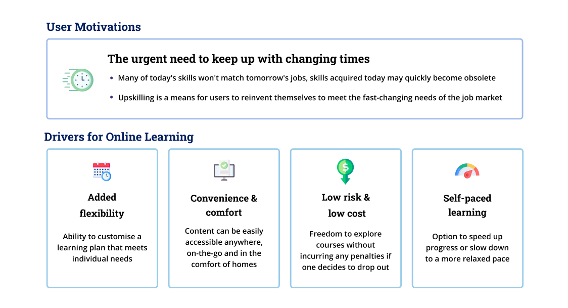
One of our biggest takeaways was that users have a strong desire for learning and upskilling. They were motivated to invest in improving their knowledge and skillsets because of the urgent need to keep up the demands of a digital workforce. As a result, online learning is an increasingly popular and preferred medium as it enables them to learn while working and growing professionally.
User Persona
Based on the insights uncovered in our research, we managed to identify 2 distinct user personas:
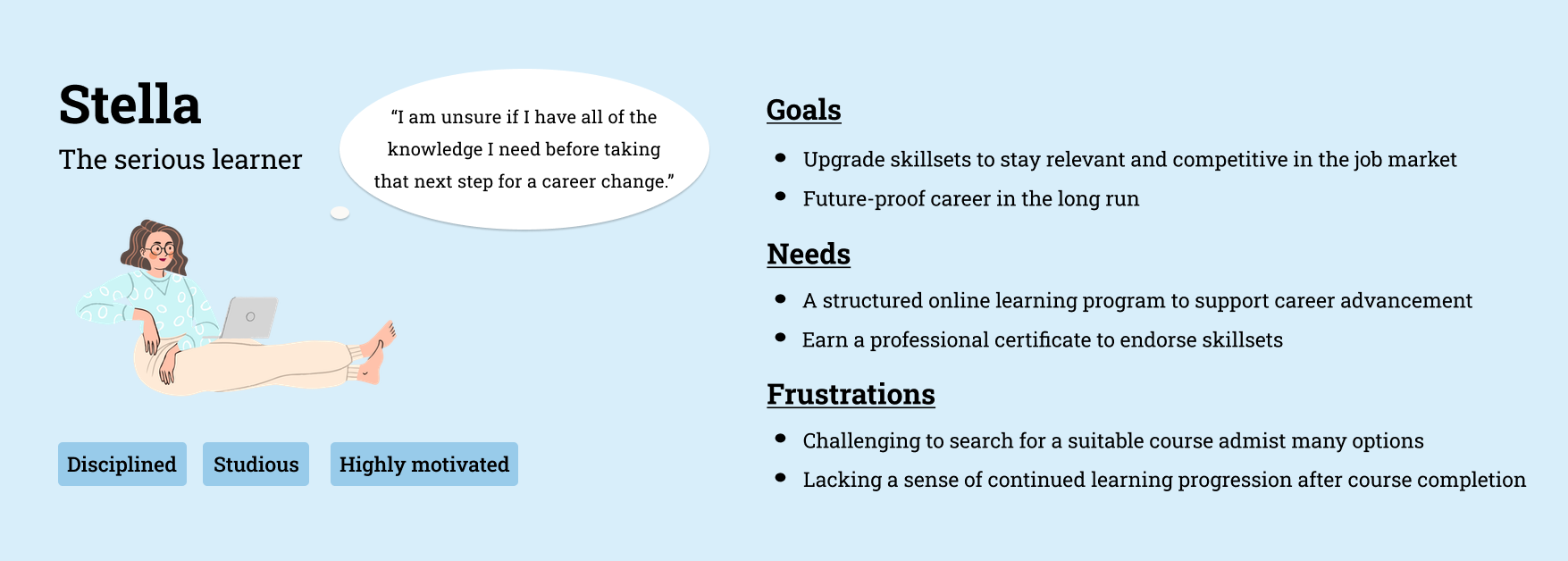
Serious Learner Stella - learns with the intention to enhance skillsets for better professional outcomes
Casual Learner Carl - learns to explore personal interests to satisfy thirst for curiosity
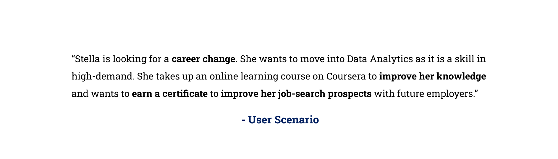
For the purpose of this redesign, we decided to prioritise Serious Learner Stella as the key user persona. Her strong drive for professional development and upskilling was a more accurate representation of the majority of Coursera users. As such, focussing on her learning needs will enable us to better design a solution that aligns with Coursera’s business goals.
Without waiting any longer, let’s get to know Stella’s scenario!
Customer Journey Map
To better understand our key persona’s needs, we mapped out Stella’s online learning experience and journey. Users tend to go through 7 key stages in their Coursera journey, namely Reflect, Discover, Consider, Evaluate, Decide, Learn & Grow. We noticed that Stella struggles the most when she searches and evaluates between course options, as well as the lack of learning continuity after she has completed a course.
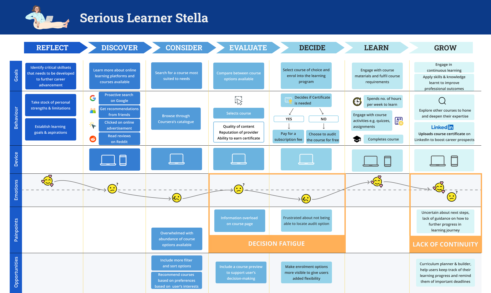
Customer Journey Map
Opportunity Areas Identified
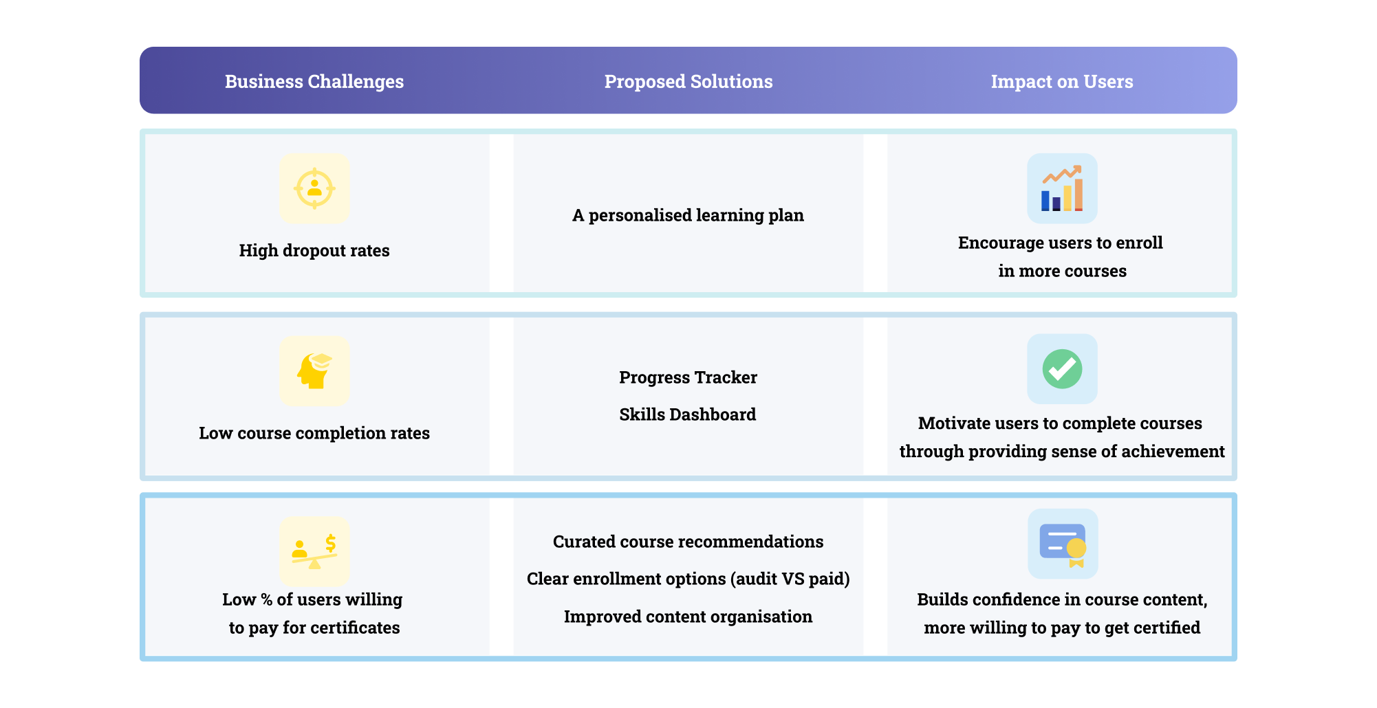
1. Reduce decision fatigue when users evaluate and compare between course options
Having more course options doesn’t necessarily lead to better decision outcomes. On the contrary, having too many choices can drain user’s cognitive load quickly and makes for an exhausting browsing experience.
It is thus imperative to save users from decision fatigue and support an easier and informed decision-making process that will match them with the right courses.
2. Promote learning continuity after users have completed a course
While Coursera’s existing Career Learning Plan feature is helpful, it does not allow users to customise a learning plan that is tailored to their unique learning needs and goals.
To support users towards continual learning, it was critical to facilitate greater learner agency by allowing users to set, plan and persist towards their learning goals through a personalised plan.
Solution Ideation
Competitive Analysis
Before we proceed to brainstorm solutions, we performed a competitive analysis to benchmark Coursera against top players in the Massive Open Online Courses (MOOC) industry. In this process, we were able to identify features that helped streamline the existing course search process and address the lack of learning continuity, which inspired our design of the proposed solution.
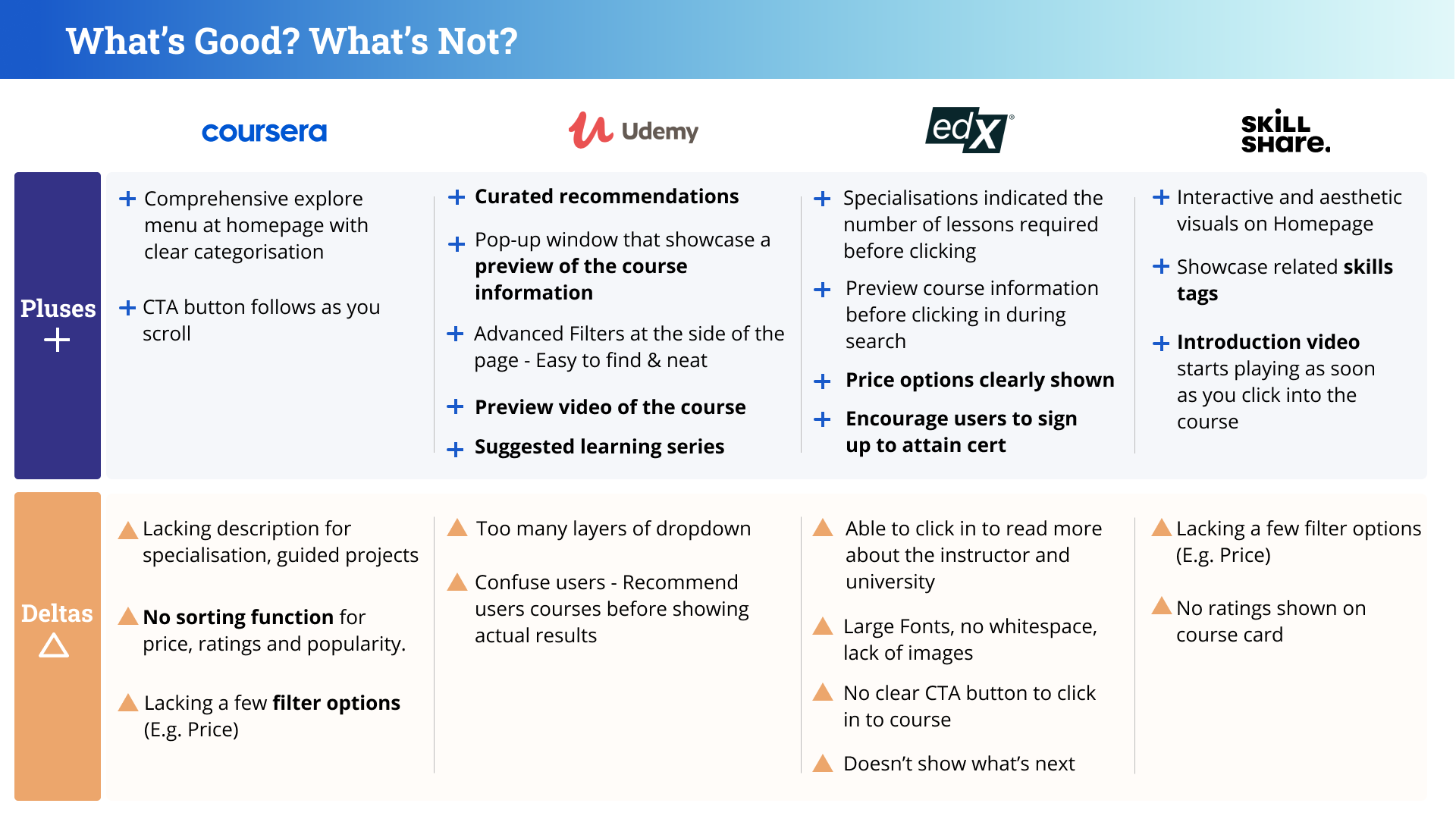
Competitive Analysis with Udemy, edX and Skillshare
Determining the Information Architecture
As Stella encountered information overload when browsing through course information pages, we needed to improve the organisation and layout of content in a way that helps users like her to better evaluate the fit of a course.
We conducted a closed card sorting exercise to better understand the information areas and considerations that users prioritise when searching for a course to enroll in. We gave users a list of key information areas typically found within a course page and tasked them to sort it based on level of importance, from “I find this most useful to know to an online course” to “I don’t think this information is useful at all”.
What did we learn from the card sorting?
Users tend to ask themselves 5 key questions when evaluating the fit of a course.
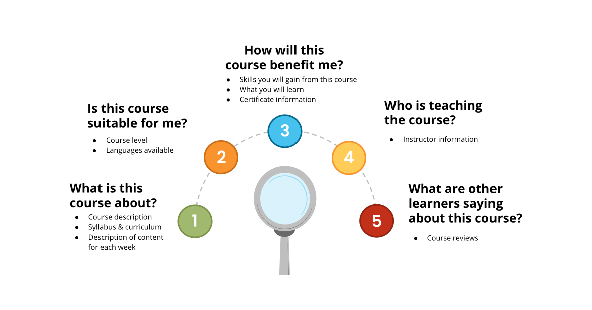
Using these insights from the card sorting, we were able to rebuild the course information page according to content that matters most to the user. We also used these insights to rearrange the order of search filters and highlight information on course cards based on the content that mattered the most to users.
Developing the Design
Now that we have gotten a clear understanding of Stella’s needs, goals and challenges with Coursera, we began designing solutions to address the opportunity areas identified.
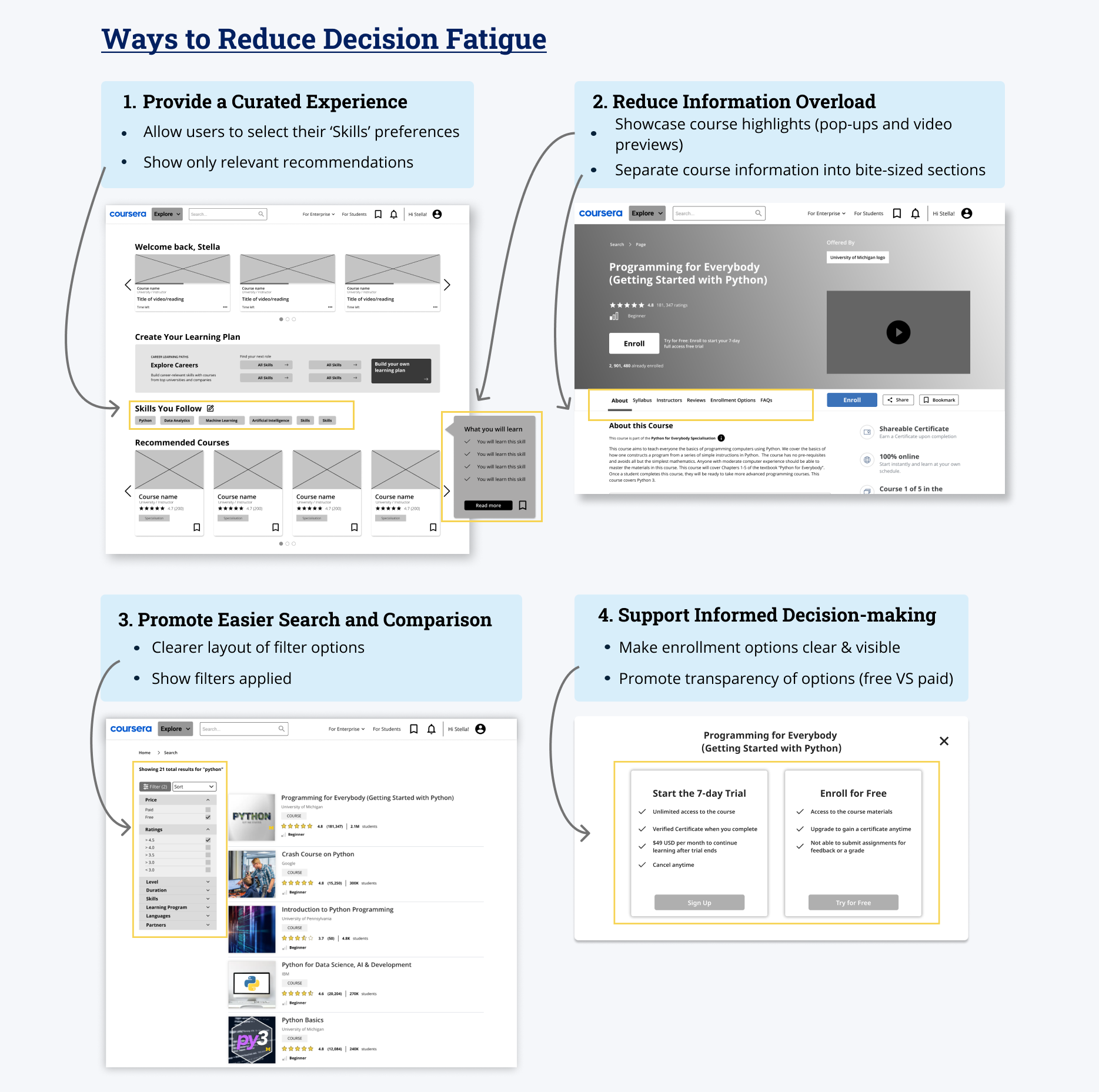
In order to reduce the decision fatigue faced by users, we prioritised the following features to optimise the search and enrolment process:
Provide a curated experience - remove unnecessary content clutter to help users access courses that they’re most interested in
Reduce information overload - enable users to quickly access most salient course information to encourage easy understanding of what the course offers
Promote easier search and comparison - helps users to expedite process of narrowing down courses to find the one that best meets their learning needs
Support informed decision-making - by allowing users to access course content for free, it lets users gain confidence in the course and encourages them to convert from a free to paid customer
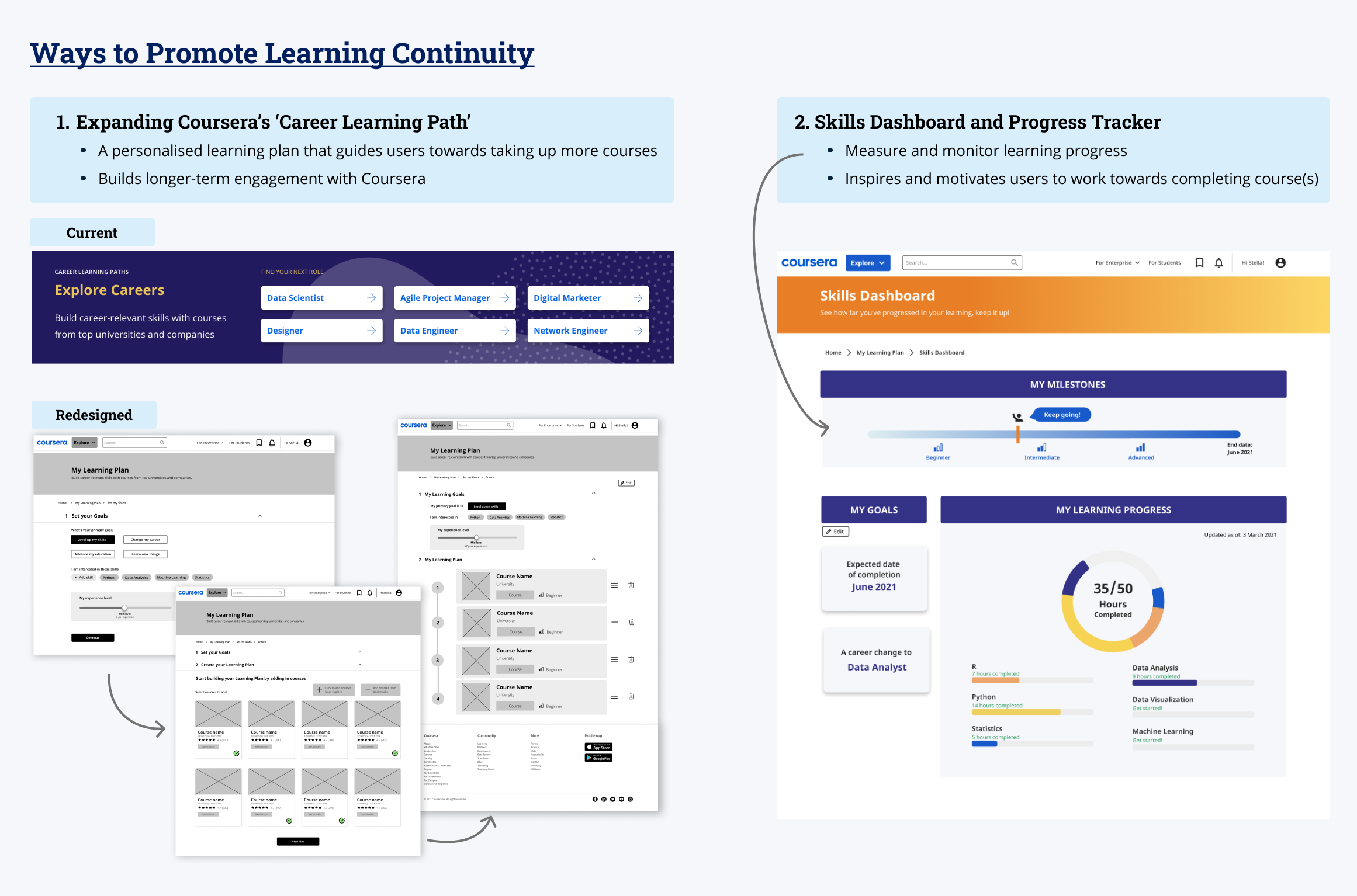
To promote learning continuity for users, we also enhanced and expanded Coursera’s existing Career Learning Plan by designing these features:
A personalised learning plan - empower users with the ability to customise a learning plan based on their unique goals to supporting their desire for continual learning
A skills dashboard and progress tracker - users can monitor and measure their learning progress through an insightful visual format. This allows them to be informed of their efforts and accomplishments, thus fuelling their motivation to complete the course(s).
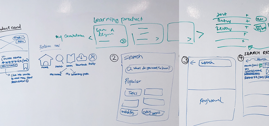
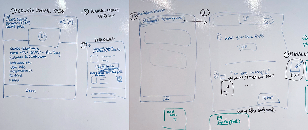
Sketching and Wireframing
With these in mind, our team began sketching out high-level user flows to articulate and refine our ideas. These sketches were then transformed and built as mid-fidelity prototypes for testing with users.
Usability Testing
To validate the usefulness of our redesign, we conducted 2 rounds of usability testing to uncover areas that worked well and areas that required further refinement in the user flow.
Users were tasked to complete 3 distinct tasks to enable us to understand what they think about the redesigned search and enrolment flow, as well as to test out the newly designed learning plan flow. We used the same tasks in both our usability tests (UT 1 & UT 2) as we wanted an unbiased test result.
Scenario:
You are thinking of making a career change into the field of Data Analytics and want to take an online course on Coursera.
Tasks:
Search for a free Python course
Register for a free Python course
Create a learning plan to find out how you can level up your skills to progress further in Data Analytics
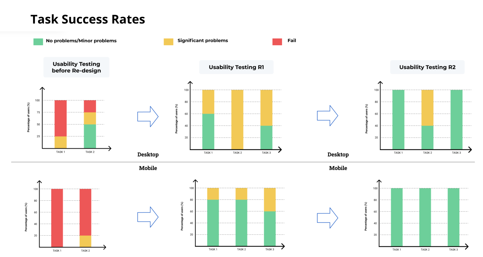
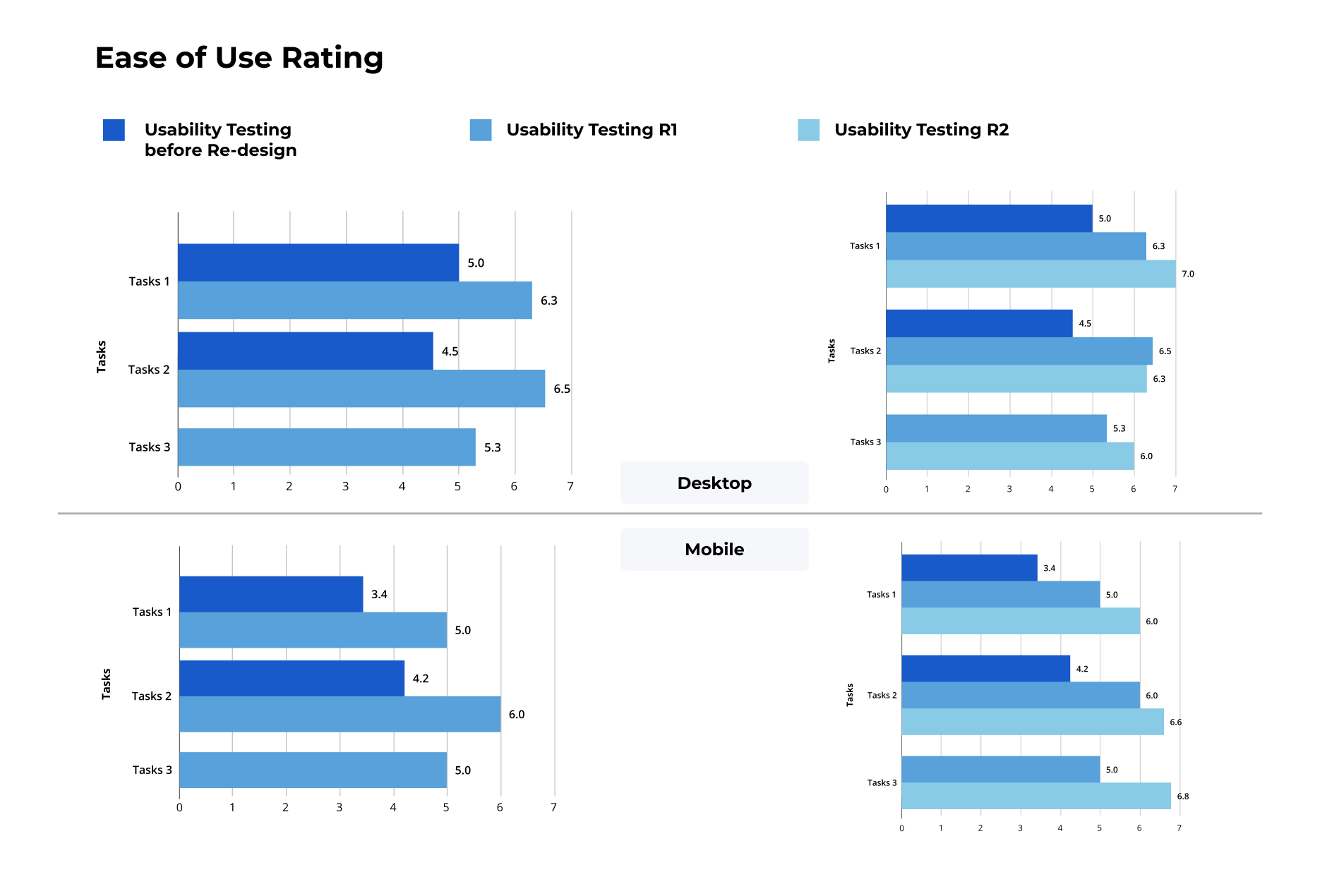
How well did the redesigned solution perform?
We were happy to find out that the overall System Usability Score (SUS) increased from 66.9 to 87.5.
Users reported an overall increased ease of use of the Coursera platform, specifically in terms of browsing, searching, and enrolling into a course.
Users expressed a strong appreciation for the new features implemented (i.e. learning plan and progress tracker), as it encouraged them to continue their learning journey and work towards reaching their goals.
What were the key changes we made to the design based on users’ feedback?
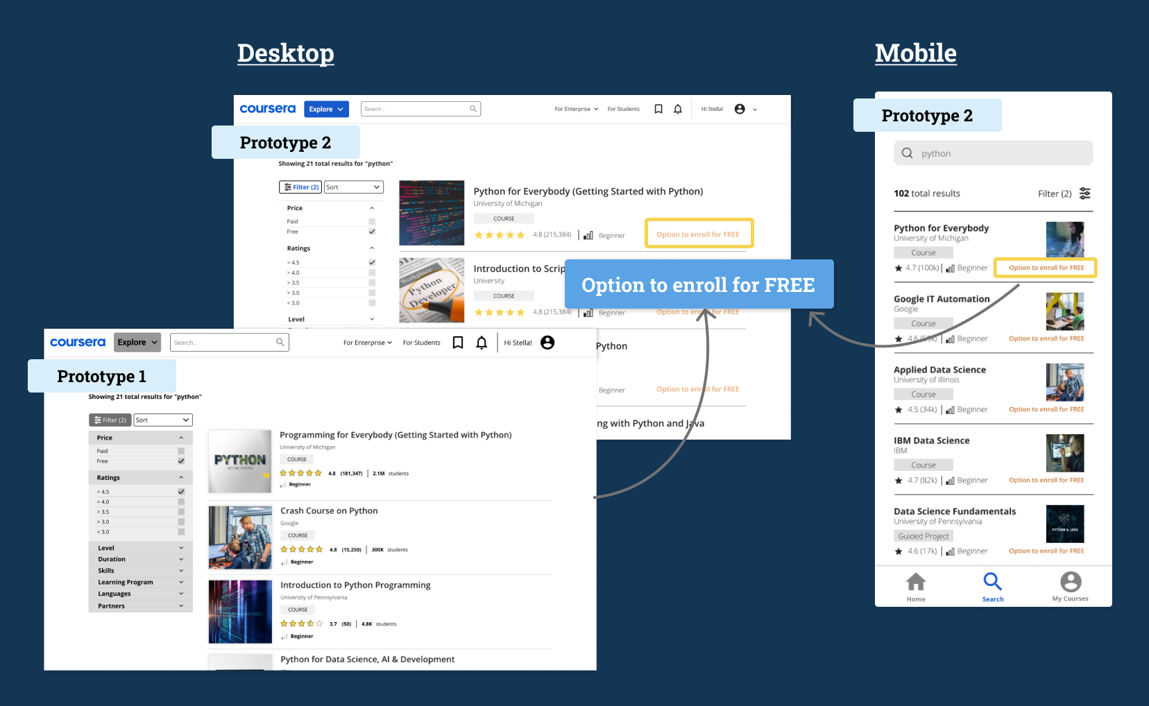
1. Increase prominence of free courses
7 out of 10 users mentioned a lack of clear indication of free courses on the search results page and course information page.
Hence, we included an ‘option to enroll for free’ tag to help users easily distinguish between free and paid courses.
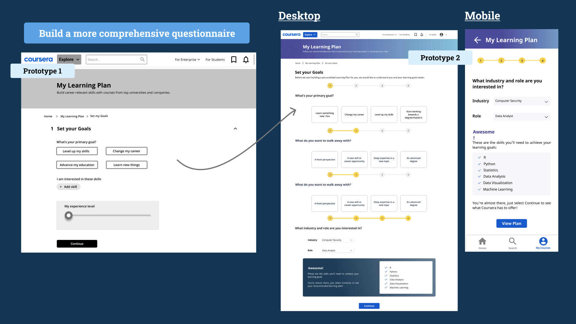
2. Create a more detailed questionnaire to personalise learning plan
6 out of 10 users were unsure how the learning plan could benefit them. We needed to include more comprehensive questions so that Coursera can better tailor a suitable Learning Plan for them. We expanded the questionnaire but was also careful to limit the number of questions to minimise user fatigue.
Aligning Users’ Needs with Business Objectives
Throughout this entire redesign process, we were intentional to make sure the solutions designed are supporting Coursera’s business objectives while addressing the challenges they face. We are confident that implementing these solutions will help Coursera grow its user base and encourage higher conversion rates of free to paid learners.
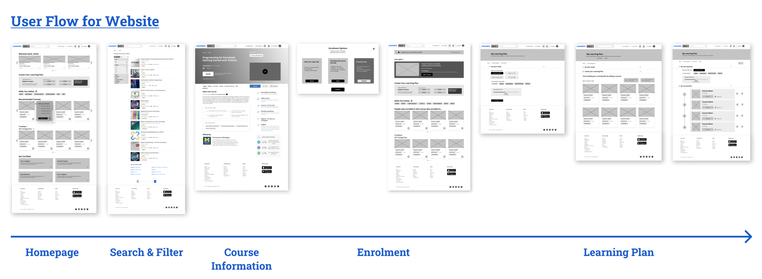
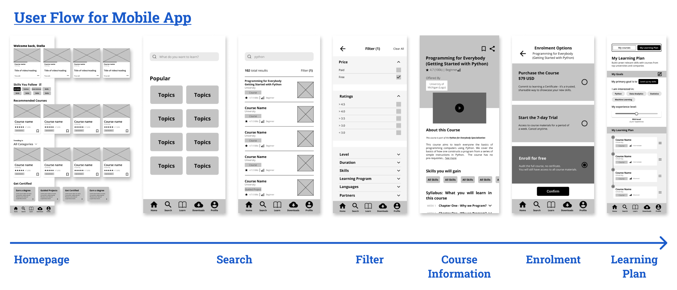
Final Prototypes
After all the hardwork we have put in, we’re happy to have you take a peek and explore the redesigned Coursera experience on both the desktop and mobile prototypes!
Desktop Prototype
Mobile Prototype
Reflections
Finding a sweet spot between business objectives and user needs
You can’t reach your business objectives at the expense of your users. When platforms are designed with the sole intention to fulfil business goals, it is more likely to cause frustration and may even further alienate your users. As a UX designer, it is imperative that we design and iterate solutions that help close this gap and leave both parties satisfied.
Continually learn from users to better the product/platform
We hypothesised that displaying positive feedback of users’ progress will motivate and encourage them to persist in their learning efforts. However, users expressed that they don’t only want to see how much they have accomplished. Their progress has to be complemented with insights on how much more they have to go before reaching their ultimate goals, which made tracking of their efforts even more meaningful.
This helped me to realise the importance of digging deeper with users to truly understand their psychological triggers and motivations. Moving forward, I would like to conduct user interviews to gain further insights to determine what kind of progress indicators that users resonate with, so as to motivate continual learning and greater engagement with Coursera.
If you’ve made it this far, here’s a big thank you for taking the time to read this case study! I hope you’ve enjoyed understanding more about how I balance between user needs and business objectives. If you have any thoughts or questions about this project, feel free to connect with me and drop a hello.